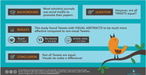
As more journals require researchers to provide them with a “graphical abstract” (GA) when they submit a paper, a new ebook has just been released to help authors over this sometimes unexpected last minute roadblock to publication.
The 24-page booklet with the self-explanatory title “How To Design a Stunning Graphical Abstract” aims to give its readers “all the best tips and tricks on how to make an outstanding graphical abstract which will with help unleash your research impact”.
Its publisher, Adelaide-based biologist and science communicator Dr Tullio Rossi, told the limbic the explosion in the number of journals and the vast number of competing articles out there means researchers need to differentiate in a way that hasn’t been necessary before.
Dr Rossi, founder of online design company Animate Your Science, likens the process to a movie producer marketing a new film – you need a great “poster” – and that’s a process that’s becoming more and more important for researchers.
Dr Rossi said he was prompted to create the DIY graphical abstract guide because when he was speaking to researchers “they had no idea on how to design graphical abstracts or even about how to get a designer to do one for them”.
“There’s no point in publishing these papers if they go unnoticed and it’s a waste of time for researchers, and the journals, which want them cited,” he said.
The first question researchers need to ask themselves is “who do I want to reach with this graphical abstract?” – a small community of peers or beyond?
That critical question about potential audience will be the deciding factor about how complex or simple the graphical abstract needs to be.
 While underlining “there isn’t a one-size-fits-all, cookie-cutter template” it does suggest four basic styles ranging in accessibility from “the classic diagram” for a predominantly peer audience graduating to the p-value (with vertical or horizontal panels), the infographic and the comic strip as you widen your audience.