 Australians can now find out the incidence rates for blood cancers such as leukaemia in their suburb, via a new interactive digital map.
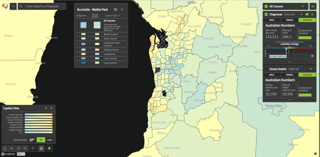
The Australian Cancer Atlas shows national patterns in cancer incidence and survival rates by location and is designed to help policy makers understand geographic disparities and health requirements across the country.
Using the map, researchers can search by postcode for details such as the rate of cases per 100,000 and how this compares to the Australian average and the number of deaths by year broken down by gender, for the 20 most common cancers including non Hodgkin lymphoma, leukaemia and myeloma.
The tool was developed by researchers from Cancer Council Queensland, Queensland University of Technology (QUT) and FrontierSI.
Disparities highlighted by the research include higher burden of leukaemia in York Peninsula, SA, where the rate of cases is 40% above the Australian average.
Cancer Council Queensland CEO Chris McMillan said the map exposes the cancer divide between metropolitan and rural areas and gaps linked to socio-economic status and other demographic factors.
“In 2018 an estimated 138,000 Australians will be diagnosed with cancer, but we know that some people face greater risks of diagnosis and death than others, due to a mix of lifestyle, behaviour, genetics and other unknown factors,” Ms McMillan said.
“The atlas enables readers to easily visualise those differences and offers critical insight into patterns of cancer and outcomes in Australia, depending on where people live, which can be used to drive research and policies going forward.”